Burnaby Mountain Golf Course & Driving Range Accessibility
This business has self-assessed as having the following accessible attributes. Please contact the business directly for further detail if required.


Mobility
Parking
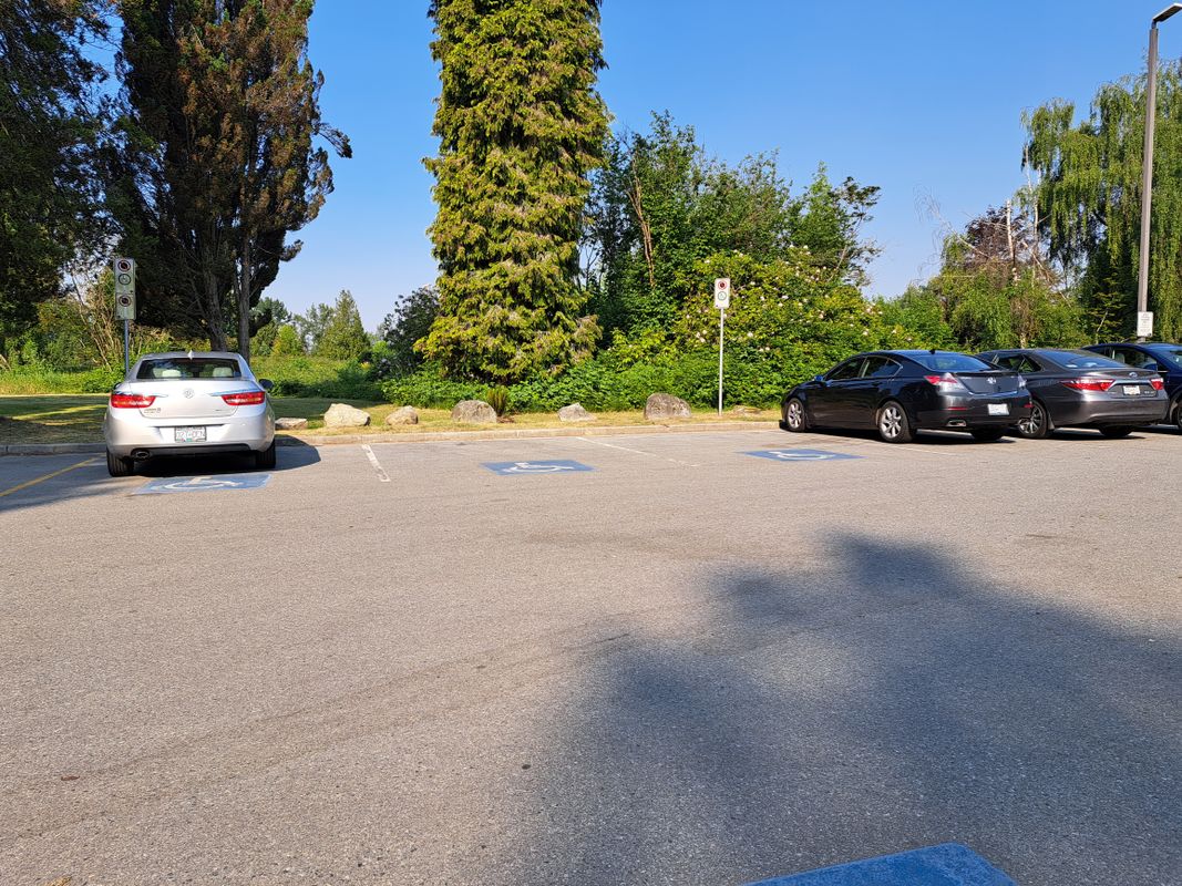
- Designated accessible parking near an accessible entrance that is specifically marked
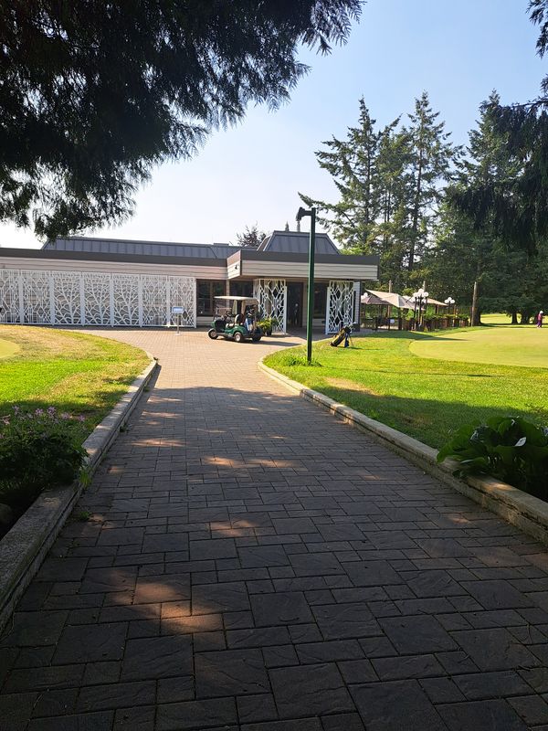
- Entrance has no steps or if there are one or more steps, there is non-slip ramp with a maximum of 5% slope
- Entry route has a door that is at minimum 815 mm wide
- One or more entry points are automated
- Can be reached without going up or down stairs, has a main entrance and/or stall that is a minimum 815 mm wide and has an outward swing door
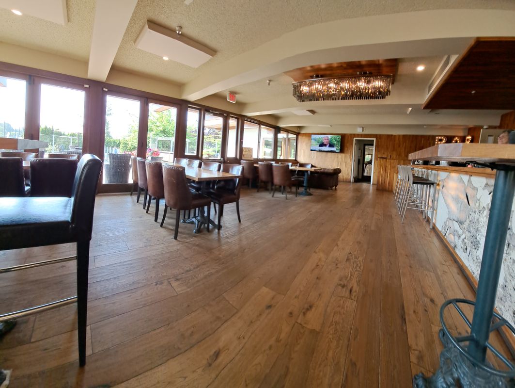
- Accessible path of travel and accessible style tables/booths
- Key activities are accessible to guests using mobility devices
- Information displays (if applicable) at a lower height
- Accessible spaces have clear views of the main activity (i.e. stage, viewing area)
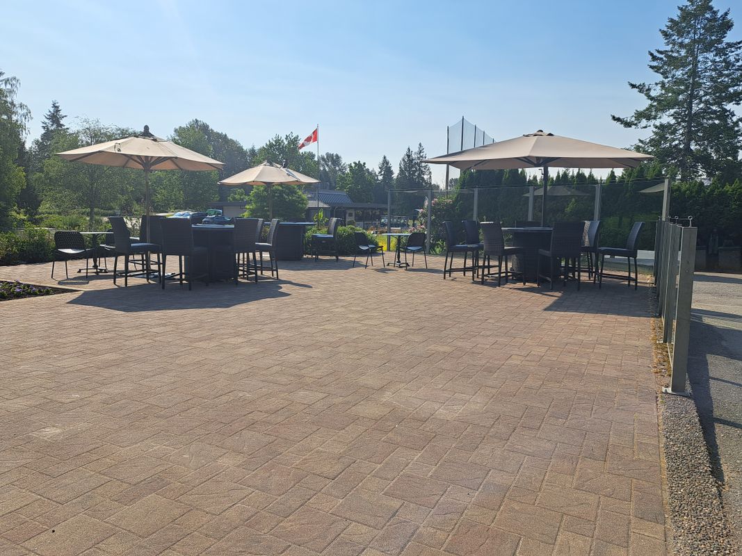
- Pathways are hard packed surfaces with a maximum slope 5%
Vision
Overall Space
- Braille/large print signage for all publicly accessible areas
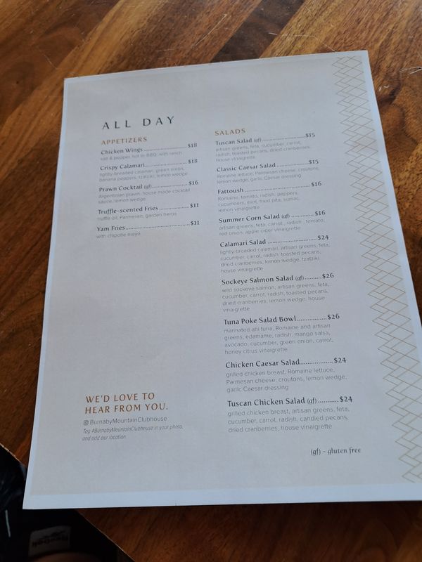
- Braille/large print restaurant menus, brochures and documents available
- Multiple lighting sources to improve visibility
Cognitive & Sensory Friendly
Overall Space
- Neutral or muted colours that are calming and subdued
- Surfaces, window coverings, and décor with minimal glare or reflection, as well as minimal use of bold patterns, shapes, or stripes
- Subtle and/or natural lighting, no florescent or harsh lighting, and no dark shadows
- Minimal visual clutter and obstacles
- Door handles have colour contrast with the body of the door; doors and frames have colour contrast with adjacent walls; any glass doors are marked to make them clearly visible
- Background noise is minimal, and alarms or auditory cues are on a low frequency
- Fragrance-free areas
- Signs are clear and concise, in large, plain font with good contrast between text and background
- Signs are well lit
- Signs have minimal glare or reflection
- Menus use large, plain fonts and simple descriptions, with minimal visual stimuli

1 / 5

2 / 5

3 / 5

4 / 5

5 / 5

Bring British Columbia to Your Inbox
Sign up for travel inspiration, seasonal activity recommendations, and useful tips.


